Summary Section
The summary section sits between the filter bar and the activity log. It packs five cards in a single row: four metric cards (Active users, Total actions, Most active user, Top category) and the Actions per day chart card on the right. All five share the same selected timeframe and the same set of filters.
Permissions
Only users with the Admin user role can access the Audit page. See the Permissions page for the full matrix.
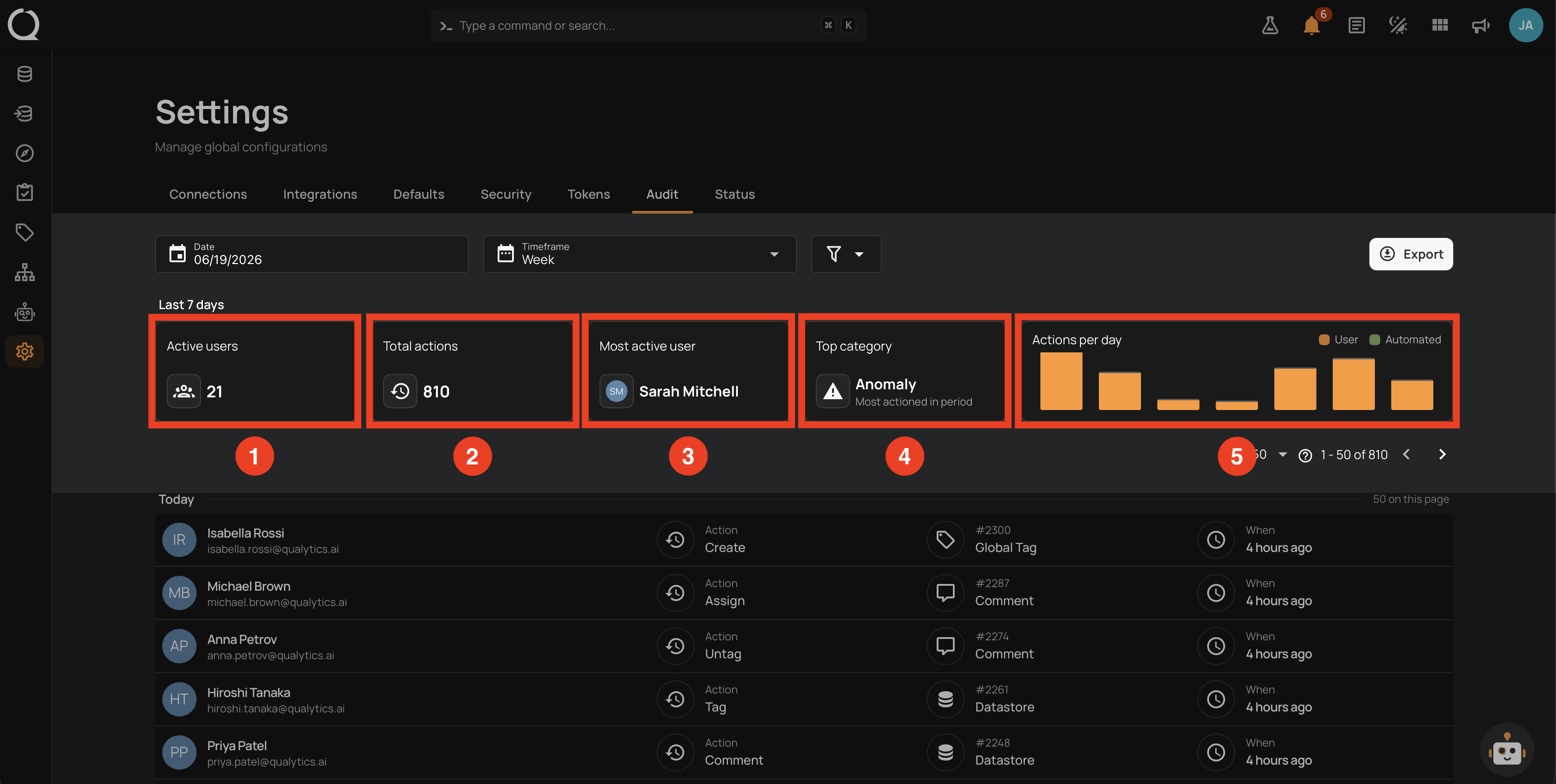
What each card shows
A Last N days label above the cards confirms the active window (for example, Last 7 days for Week, Last 30 days for Month).
| # | Card | What it shows |
|---|---|---|
| 1 | Active users | Count of distinct human users who took at least one action during the timeframe. This card always excludes internal users, even when the Hide Qualytics filter is off. |
| 2 | Total actions | Total number of actions during the timeframe. Values above 999 are abbreviated (1.2k, 3.4M); hover the card to see the exact, formatted number in a tooltip. |
| 3 | Most active user | Avatar and display name of the user with the highest action count in the timeframe. Hover the card to see the exact action count. When no activity matches the filters, the card shows a dash placeholder. |
| 4 | Top category | Icon and label of the entity type that received the most actions in the timeframe (for example, Anomaly, Quality Check, Datastore). The hint Most actioned in period sits below the value. Hover the card to see the exact action count for that type. When no activity matches the filters, the card shows a dash placeholder. |
| 5 | Actions per day chart | Stacked bar chart of action volume over time. See the Actions per day chart section. |
Actions per day chart
The chart card breaks the total action volume in the timeframe into two series:
| Color | Series |
|---|---|
| Primary | User (actions from human users). |
| Secondary | Automated (actions from internal users). |
The legend sits in the top-right corner of the chart card. The Automated series and its legend entry are hidden whenever the Hide Qualytics filter is on.
Bucket width
The chart title and bucket width adjust to the selected timeframe so the chart stays readable:
| Timeframe | Chart title | Bucket |
|---|---|---|
| Week | Actions per day | One bar per day |
| Month | Actions per week | One bar per week |
| Quarter | Actions per month | One bar per month |
| Year | Actions per quarter | One bar per quarter |
Tooltip and empty buckets
Hover any bar to see its tooltip. The tooltip shows the bucket label (for example, Mar 12, Mar 9, Q1 2026) and the count of actions for each visible series in that bucket.
Buckets with zero activity display as low, muted bars so the time axis stays continuous. This makes weekends and quiet periods easy to spot in Week and Month views.
Cards and chart refresh in lock-step with the log
When you change a filter, the cards, the chart, and the activity log refresh together. While a refresh is in flight, the previously loaded values stay visible to avoid intermediate flicker.
Bucket aggregation
Activity is recorded as daily counts and aggregated into the wider buckets above based on the selected timeframe, so the chart and the cards always describe the same population.