View AI Explanations and Recommendations
Learn how to open the AI-augmented Quality Score panel, read every section of it, drill into a dimension's history, and act on the Recommendations. This tutorial works the same way at the datastore, container, and field levels because the same panel is reused across all three, except Step 7, which field panels do not offer.
Prerequisite
The AI content described below requires AgentQ to be configured for your workspace. Without it, the panel still opens but renders only the static content (no AI summary, no per-dimension AI text, no Recommendations, no sparkle icon on the Quality Score chips). See the AgentQ Integration documentation to configure it. For the concept-level anatomy of each indicator, see AI Explanations and Recommendations.
Steps
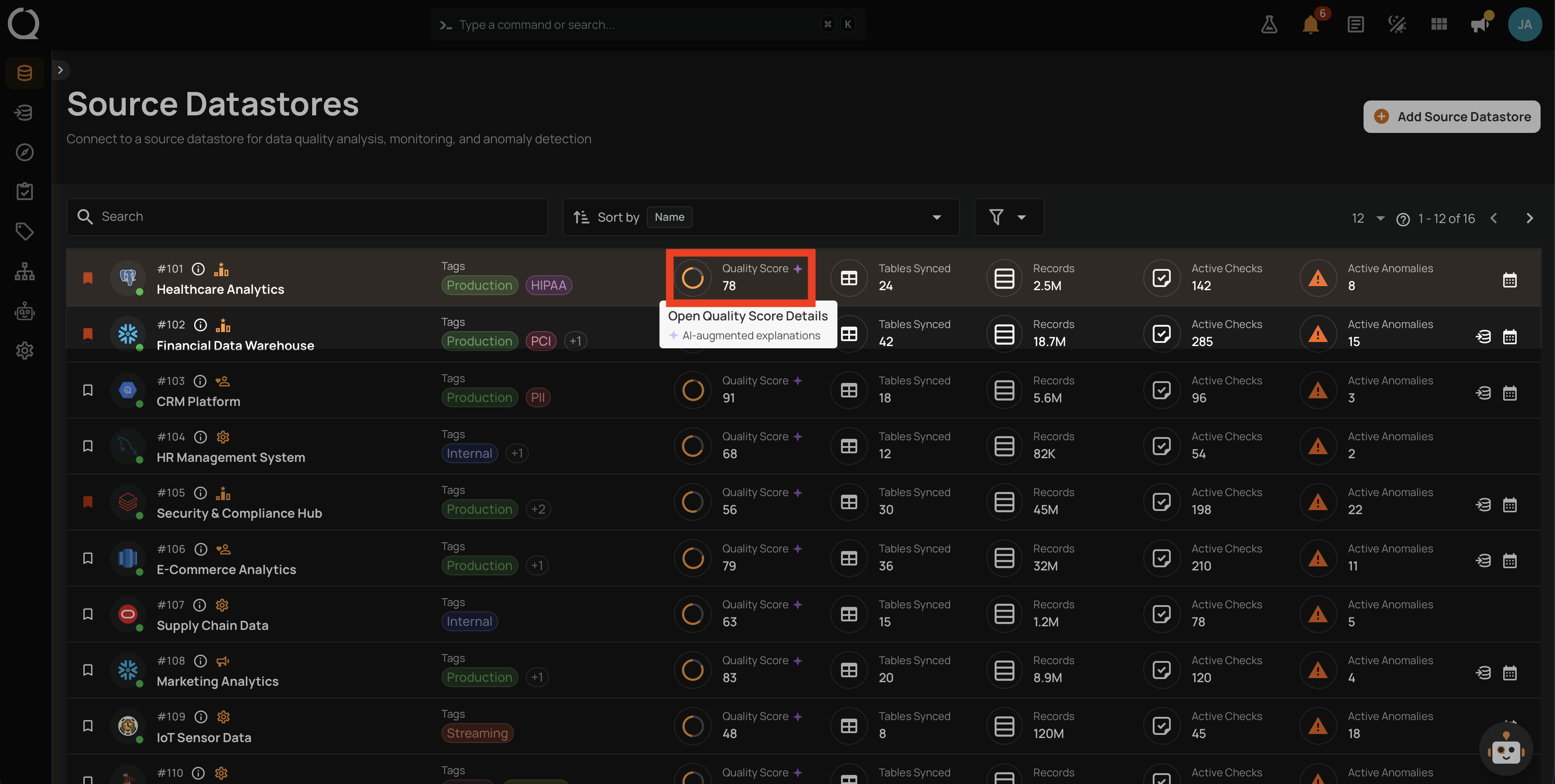
Step 1: Locate any Quality Score chip in the platform (on the Datastores listing, on a datastore or container overview, on the Explore fields view, or in an inline metadata card). Hovering the chip shows a tooltip with two lines: Open Quality Score Details and AI-augmented explanations. Click the chip to open the panel.
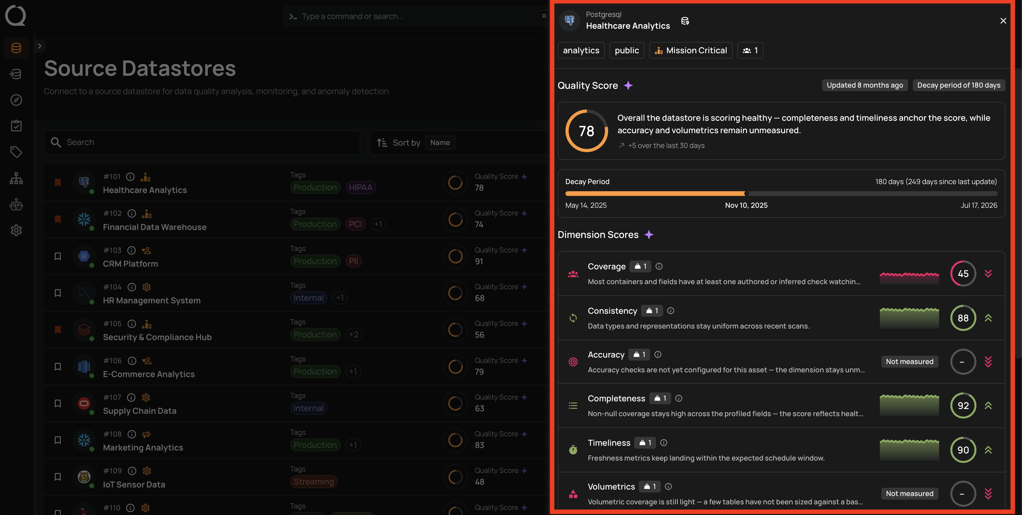
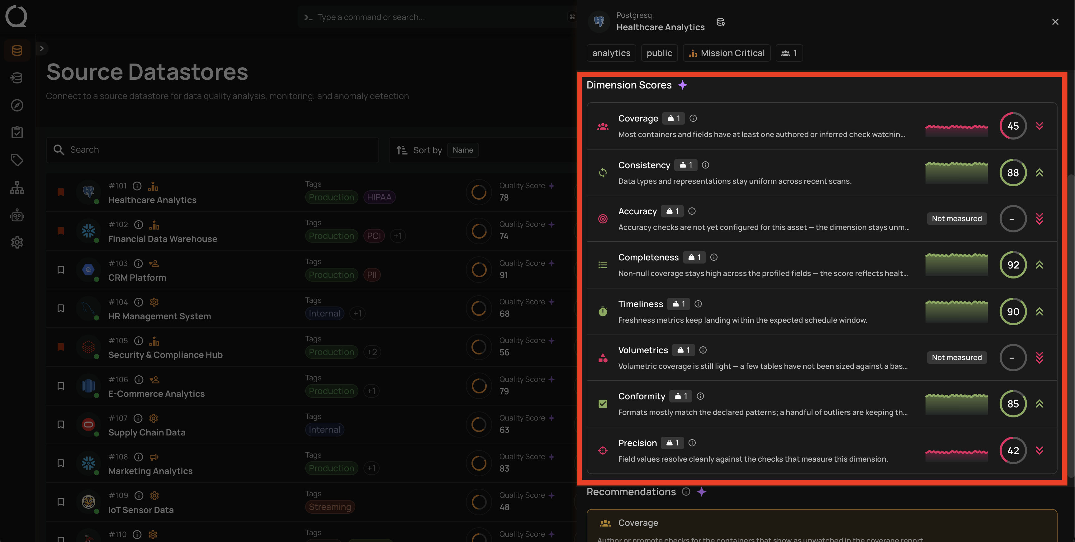
Step 2: The Quality Score panel slides in from the right of the screen (highlighted in red in the screenshot below). It is organized top-to-bottom into three main sections: a header with the asset info plus the Quality Score summary and decay-period bar, a Dimension Scores section with one row per dimension, and (when applicable) a Recommendations section at the bottom.
Step 3: Read the header. It has four elements, numbered in the screenshot below.
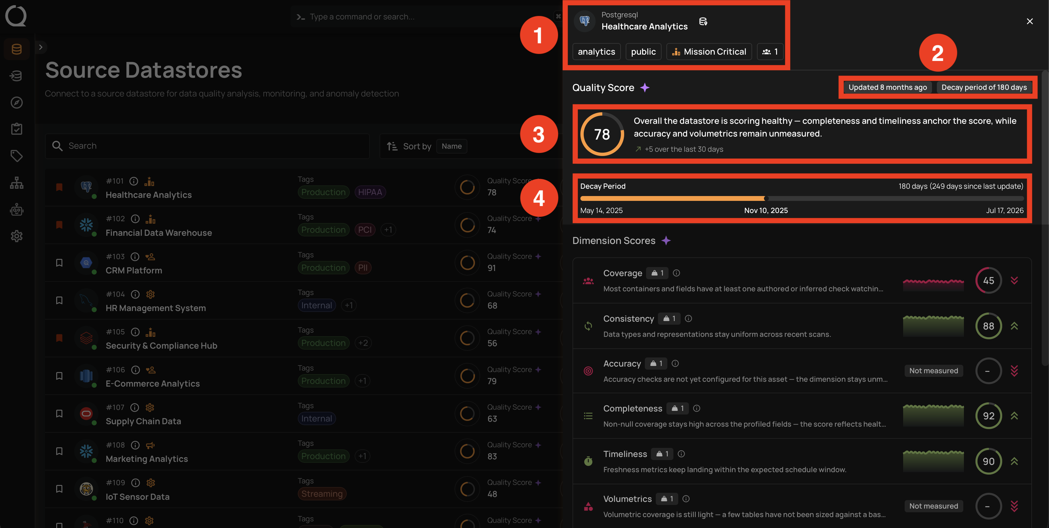
| No. | Element | Description |
|---|---|---|
| 1 | Asset info block | Shown at the top of the panel with the asset name, its type badge, and its tags. |
| 2 | Metadata badges | Shown on the right of the Quality Score heading. The first badge reports when the score was last updated; the second badge reports the current decay period. |
| 3 | Score card | The large circular gauge shows the numeric score and, next to it, the AI summary describes the score's main drivers in one sentence. The sparkle icon on the Quality Score heading indicates AgentQ is providing the explanation. |
| 4 | Decay Period bar | Visualizes the window the score covers. The window's start, today's date, and the window's end are labeled underneath. |
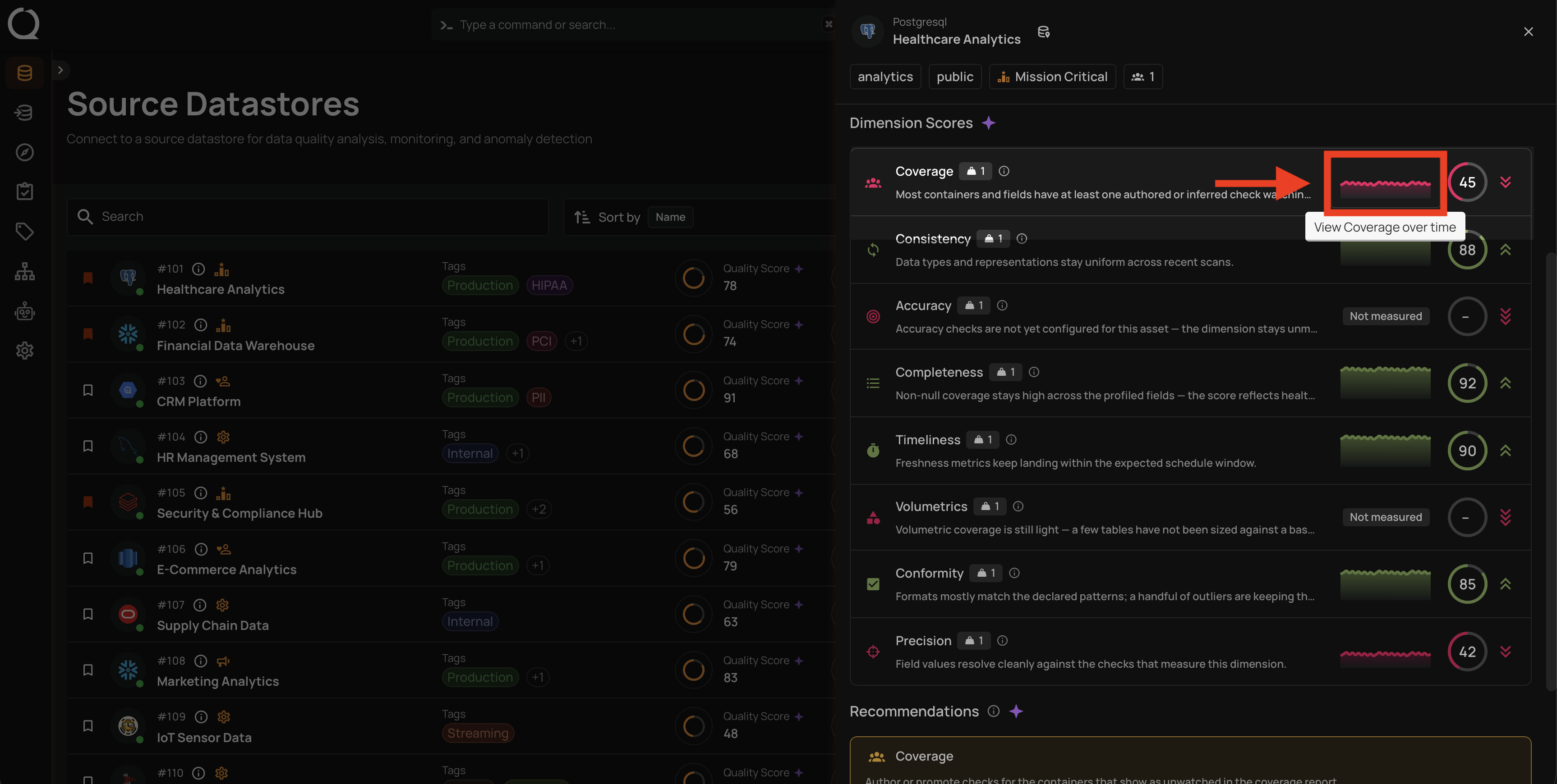
Step 4: Scroll to the Dimension Scores section. Each row shows one of the 8 dimensions with the dimension name and icon, a small weight badge (the weight in effect at the moment the score was measured), the AI-written explanation of how the dimension is currently affecting the total score, a small sparkline of the dimension's recent history, the dimension's own circular score badge, and a chevron-stack indicator on the right edge showing whether the dimension is boosting (green chevrons) or dragging (red chevrons) the overall score, with more chevrons meaning a stronger effect. Dimensions that have not been measured for this asset show a Not measured pill instead of a numeric score. On a datastore or container panel, a dimension whose checks currently have open anomalies also shows a red count pill next to its name, and a hint line above the rows names the dimensions you can click.
Step 5: Hover the sparkline on any measured dimension row. A tooltip appears reading View
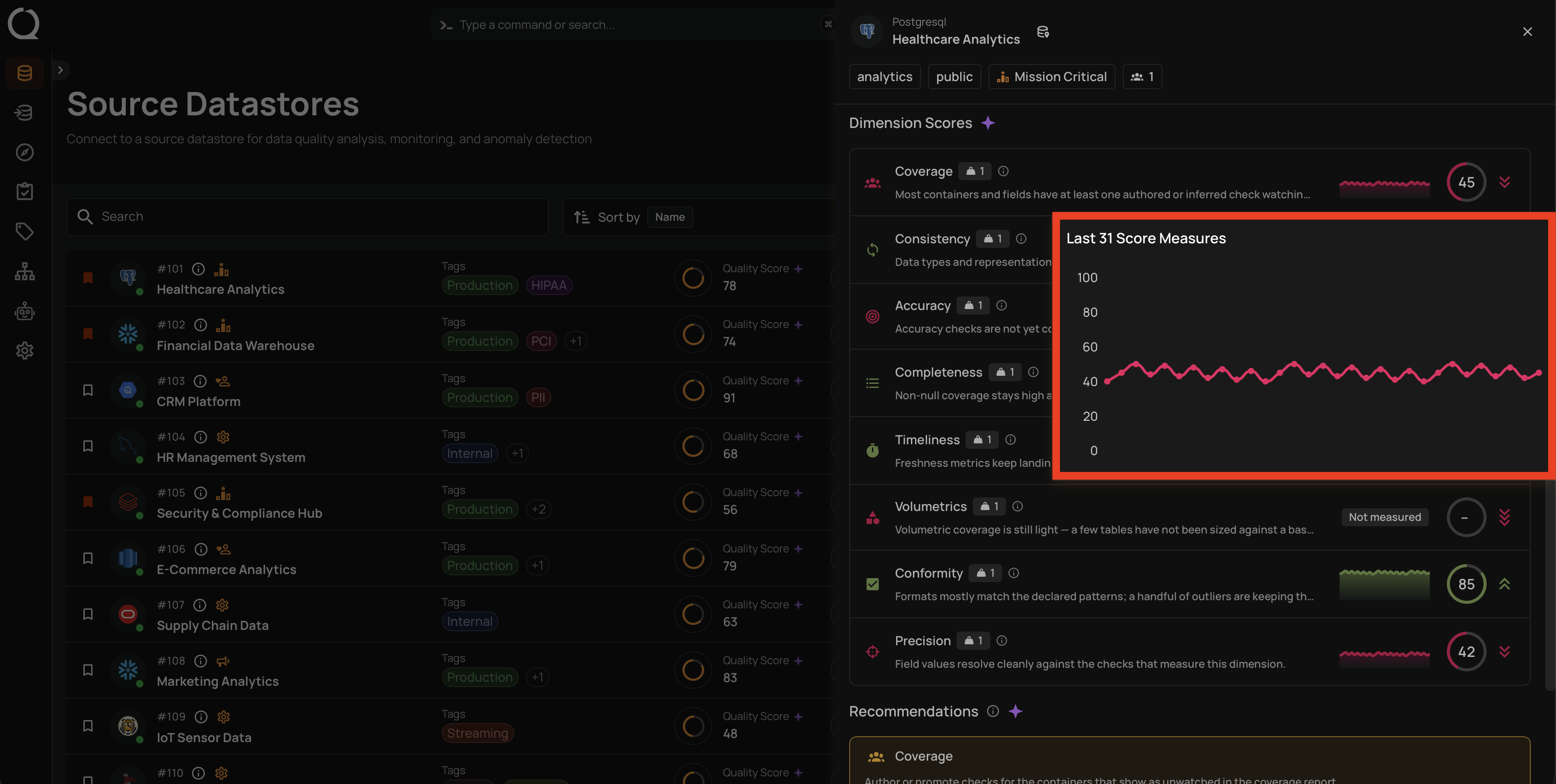
Step 6: Click the sparkline to open the trend chart. A Last N Score Measures overlay appears next to the dimension row with a line chart plotting that dimension's score across its most recent measurements (up to 10). Use it to see whether the current value is a spike, a steady drift, or a stable baseline. Click outside the chart or press Esc to dismiss it.
Step 7 (datastore and container panels only): Click the name of a dimension that shows a count pill . Skip this step on a field panel, which has no pills, or when no dimension shows one. A side panel named after the dimension, for example Accuracy Checks, opens over the Quality Score panel, listing the checks of that dimension with open anomalies inside the decay period, favorites first and then by the number of active anomalies. Click a card to open the check, or its View N active anomalies button to go straight to the anomalies. Close the side panel to return to the Quality Score panel, which stays open behind it.
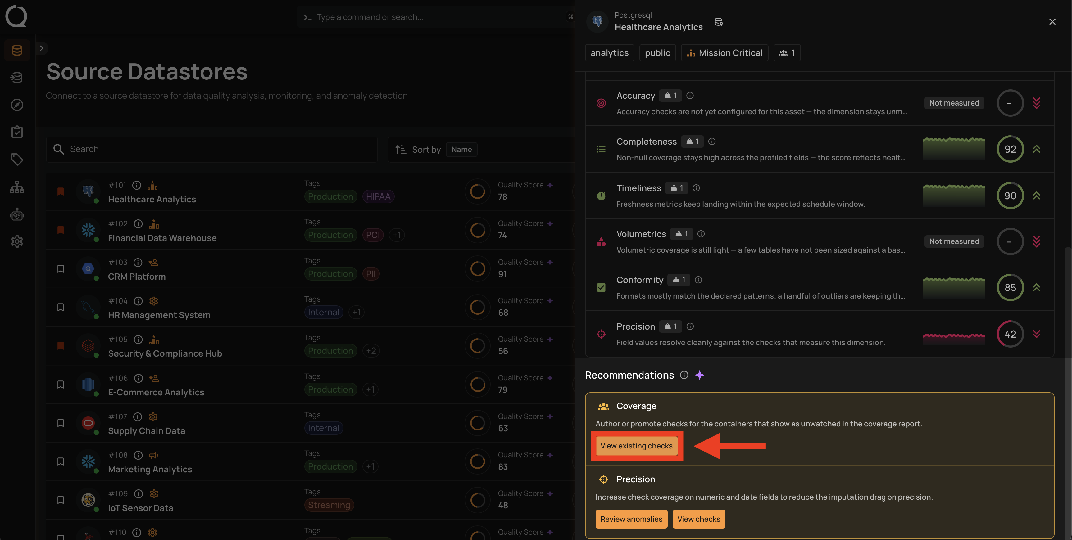
Step 8: Scroll to the Recommendations section at the bottom of the panel. This section appears only when at least one dimension scores strictly below 50. Each qualifying dimension gets exactly one entry in the amber-bordered section, naming the dimension, restating its icon, and carrying an AgentQ-written paragraph of advice specific to the asset. When every dimension meets the threshold, the section is hidden entirely (no empty state).
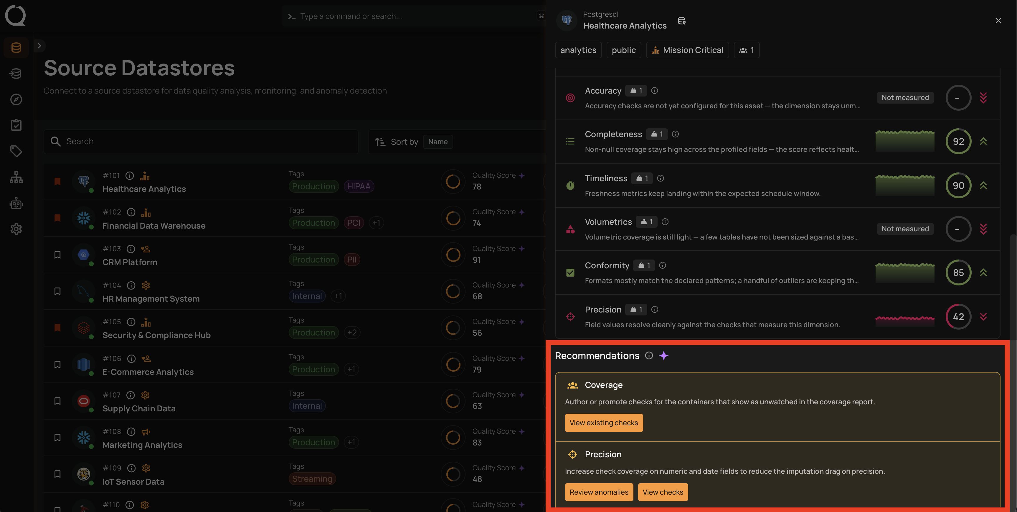
Step 9: Act on a recommendation. Each entry carries one or more inline action buttons. Most jump to a pre-filtered view for the asset (for example, the anomalies that back the recommendation), on a datastore or container panel View checks on a dimension with open anomalies opens the same side panel as Step 7, and an Add a check button opens the create-check form directly. Click a button to follow the shortcut and start remediating the issue without re-selecting filters.